2018 brings with it a richness, building on the colours of 2017. Think calm, think luxury, think colours that counteract the fast pace of life we live every day. This year’s colours, mixed with the new trend in simplistic interiors (think KonMari), are all about slowing down and creating that space to come home to and unwind in.
Black on Neutrals
Black is the new black. Not just any black though, grey-black (black chiffon) is a particularly popular colour, followed by purple-toned black such as Shadow, and the “less is more” Deep Onyx. Pair these up with gorgeous neutrals such as Cream, Thunderbird, Kombucha or Wabi-Sabi and your room is sure to make a statement.


Berries and Blush
The Pantone colour of the year is Ultra Violet. Mix that with the other berry tones that are popping up such as Caliente, Dark Plum, Chinoiserie Red and the subtler Blush and you’ve got this year’s rich berry palette ready to go.


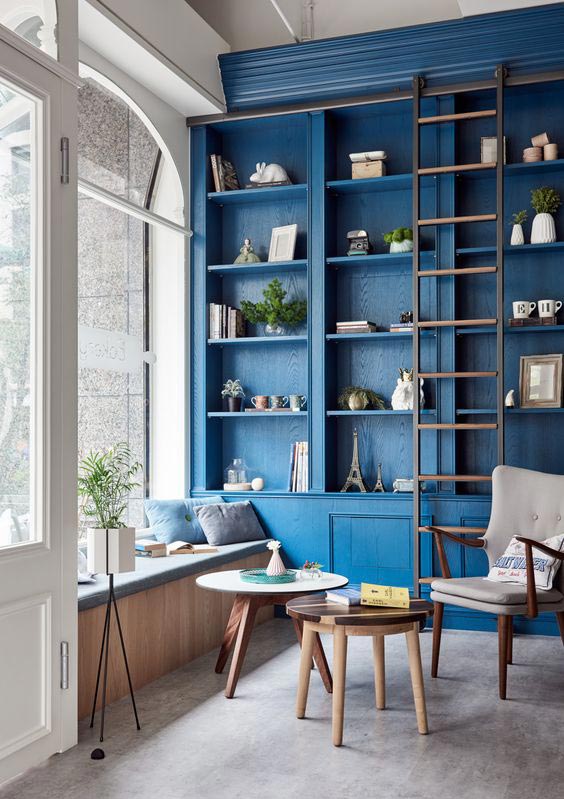
Blues and Greens
Always calming, this year takes a huge leap into this palette and anything from bold to subtle goes. Think Sage, Oceanside, Bottle Green, Oval Room Blue, Deep Turquoise, Olive, and Dusk. Apparently, this year there is no such thing as too much blue and paired with some subtle green accents or a statement wall is all you need to get this look.


Not just fifty shades of it, but all the shades! Grey with pink undertones, grey with purple undertones, blue undertones, green, grey on grey, almost-white grey, every possible shade imaginable! We’re seeing a lot of this paired with whites such as Stone White and Ramie.


The Accents
Along with all the above, we’re seeing colours used in smaller sections as statements which compliment and accentuate the cool 2018 palette. Super rich earthy colours like marigold, Civara, Burnt Brick and Artisan’s Gold are the perfect contrast. Use these to paint the inside of your bookshelf, a small coffee table or the skirting of the whole room.


Andre Ter Moshuizen: 082 602 1367 | andre@norgarb.co.za | www.norgarbproperties.co.za
www.harfield-village.co.za
www.facebook.com/harfield.village.community